


product designer portfolio

I design digital products from discovery to delivery: research, flows, interfaces and the brands around them.

Brazilian · currently based in Europe


Open to Product Designer roles

hi,
i'm alice!

Product · UX/UI · Brand designer

From Salvador, Brazil · now living in Europe

I'm a Product Designer with over five years of experience in digital products. I specialise in UX research, journey mapping, usability testing and interface design, and I've led design processes in multidisciplinary teams. With a background in graphic design and systems development, I connect creative thinking with how things get built. Originally from Brazil, I'm currently based in Europe and work with teams remotely.

  • 5+ years in product
  • 7 product case studies
  • 4 brand identities
  • Real clients incl. Ford
Alice Andrade on Westminster Bridge in London, with the London Eye behind her

Based in Europe

Selected work at a glance

Product design

End-to-end ownership of mobile apps and web platforms, from briefing and flows to high-fidelity prototypes and developer handoff.

UX research

Interviews, surveys, usability tests, CSD matrices, personas and empathy maps that turn opinions into decisions.

UI & design systems

Styleguides, colour and type systems and reusable components that keep products consistent as they grow.

Brand & communication

Logos, visual identities, sales decks and social campaigns that carry a product into the world.

Tourists don't need more options. They need help choosing and organising them.Research insight · Visit SP

The biggest problem wasn't the failures. It was how long it took anyone to notice them.Research insight · Solar platform for Ford

case
studies

Seven products for tourism, health, energy, sport and animal welfare. Six were designed for real clients; LovePatas was a study project. Each one started with research and ended with something people could use.

01 / 07Visit SPA tourism app that plans your days in São Paulo

  • Client · Horizon
  • Mobile app
  • UX/UI

The challenge

Tourists visiting a city as large as São Paulo jump between apps and websites to decide where to go, what to eat and how to organise their days. The goal was to bring all of it into one simple experience.

Research

I ran user interviews, surveys and usability tests. The pain point was clear: there is so much to do that visitors felt overwhelmed and struggled to organise an efficient itinerary.

The solution

The itinerary builder became the core of the app. Users enter where they are and how many days they'll stay, and Visit SP builds a day-by-day plan grouped by neighbourhood.

My role

Product Designer at Horizon, leading design end to end alongside front-end and back-end developers. The app was launched and delivered to the client.

  • Research
  • Information architecture
  • User flows
  • Wireframes
  • Hi-fi UI
  • Handoff
Visit SP home screen: search, community, business sign-up, travel agents and most searched destinations

Key insightTourists don't need more options. They need help choosing and organising them.

  • Custom itineraries by location and trip length
  • Audio guides in several languages
  • Search & map for food, hotels and events
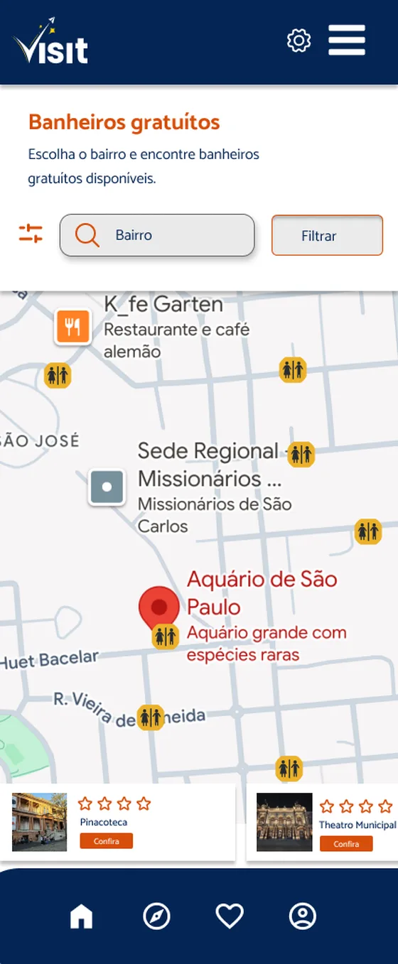
  • Free restrooms map

How research shaped the product

  1. ListenInterviews and surveys with tourists about how they plan a trip to São Paulo.
  2. Find the painSo much to do that visitors felt lost and wasted time organising their days.
  3. DecideDon't add more options. Help people choose and put them in order.
  4. Build & testThe itinerary builder, grouped by neighbourhood, refined through usability tests.
The journey, screen by screenScroll sideways →
Home screen
01HomeSearch the city and join the community
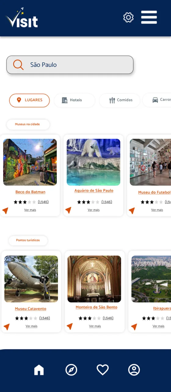
Search results for São Paulo with category filters
02ExplorePlaces, hotels, food and transport by category
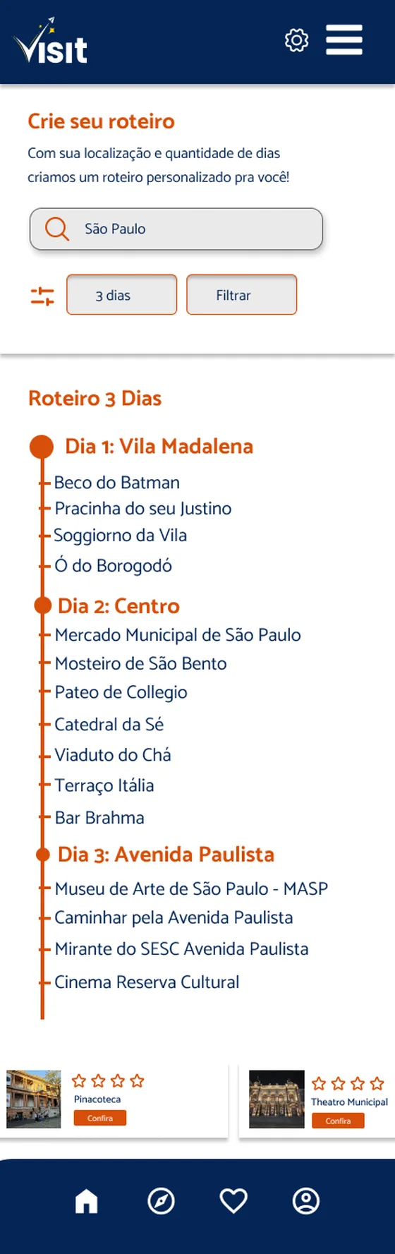
Itinerary builder showing a 3-day plan by neighbourhood
03Build an itineraryLocation + number of days = a plan grouped by neighbourhood
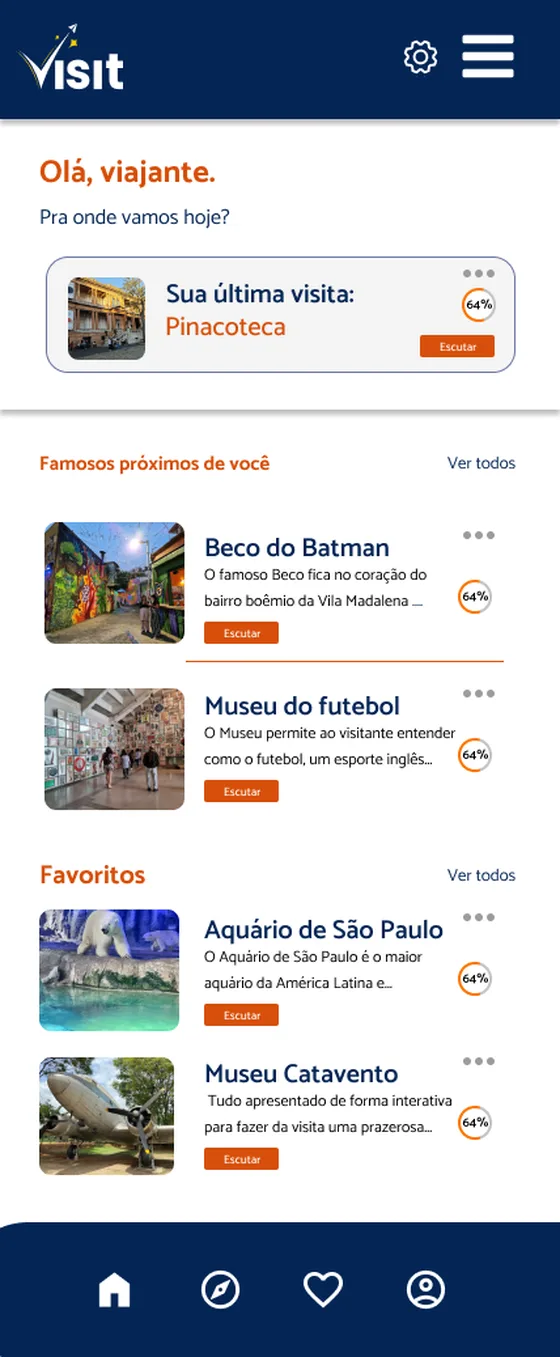
Audio guide hub with last visit, nearby attractions and favourites
04Audio guidesPick up where you left off, or find what's nearby
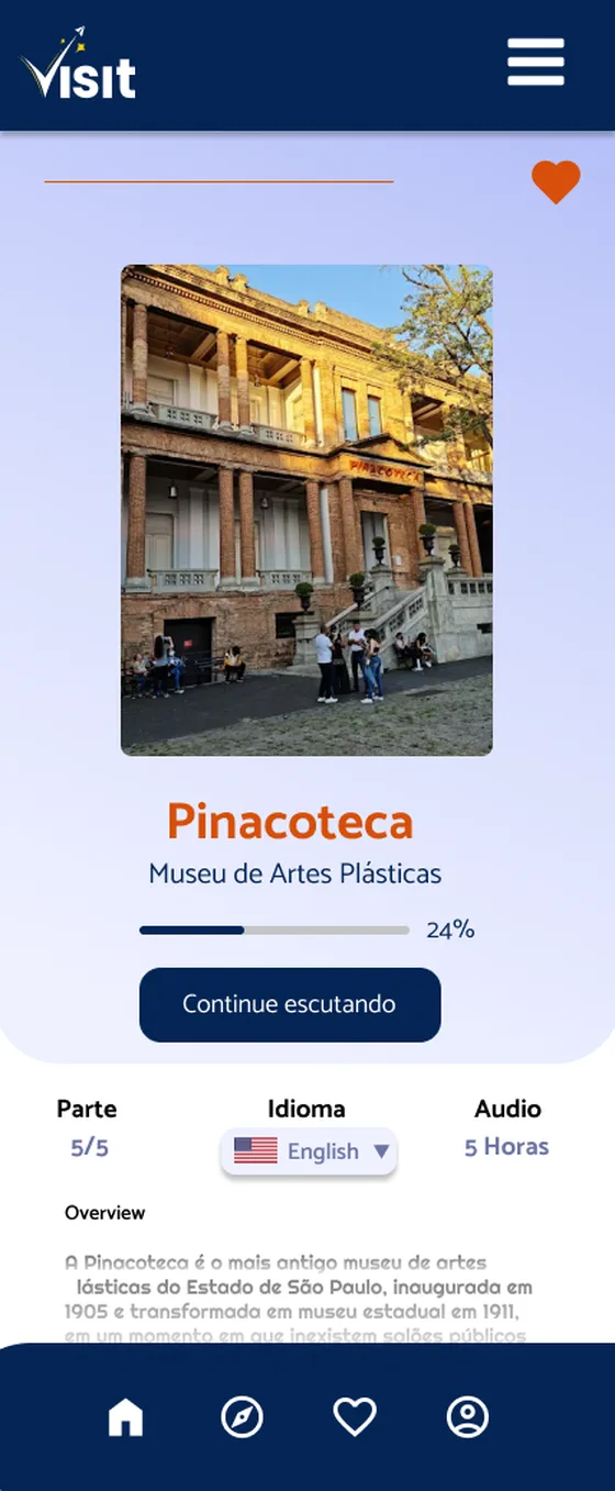
Pinacoteca attraction page with progress and language selector
05AttractionProgress, parts, length and language at a glance
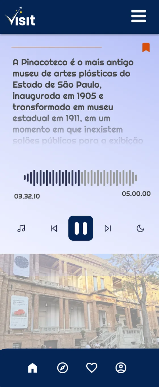
Audio player with transcript and waveform
06ListenPlayer with live transcript and sleep mode
Map of free public restrooms by neighbourhood
07Free restroomsPublic restrooms by neighbourhood, for long days out

02 / 07Solar Monitoring PlatformReal-time monitoring of solar installations, designed for Ford

  • Client · Ford
  • Horizon
  • Web platform

The challenge

When a solar panel failed, customers took a long time to notice and even longer to tell the company. Systems underperformed, repairs were delayed and customers lost money without realising it.

Research

Interviews, surveys and usability tests with the company team and panel owners showed that the problem wasn't the failures themselves but how long it took to notice them. That made real-time alerts and clear status the core of the platform.

The solution

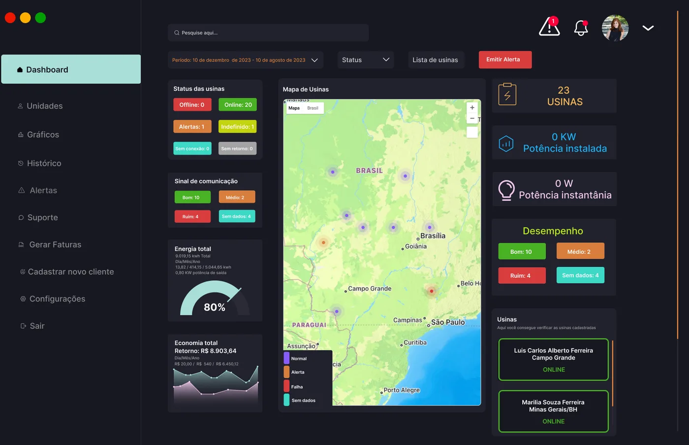
One platform for two audiences. The company monitors every installation on a dashboard and a map, gets an alert the moment something breaks and sends a technician straight away. Customers see their system's performance, energy generated and money saved.

Outcome

A reactive process became a proactive one: problems are spotted in real time, repairs happen sooner and customers can see their investment working.

Dashboard: plant status, communication signal, energy, savings and a map of plants across Brazil

Before → afterThe customer used to report the problem. Now the company spots it first.

  • Dashboard status, energy and savings
  • Plant map coloured by status
  • Smart alerts by component and severity
  • Plant details by panel, inverter and string

The repair journey, before and after

Before: reactive
  1. A panel or inverter fails.
  2. The system keeps producing less, and nobody notices.
  3. Days later, the customer finally notices.
  4. The customer calls the company.
  5. A technician is scheduled. Money has already been lost.
After: proactive
  1. A panel or inverter fails.
  2. The platform raises an alert straight away, with the component and severity.
  3. The company sees it on the map and sends a technician.
  4. The customer follows the status and their savings in the app.

03 / 07FEF BahiaManagement app, sales decks and social campaign for a football federation

  • Client · FEF Bahia
  • Product
  • Visual identity
  • Campaign

The client

The Federação das Escolas de Futebol da Bahia supports, certifies and develops community football schools across the state, using sport as a tool for social change.

The challenge

Schools run on passion but little structure, tracking athletes, attendance and payments on paper or in chat apps. At the same time FEF was launching a statewide programme with the Ministry of Sport, covering all 417 municipalities in Bahia, and had to win over coaches, families and sponsors.

What I designed

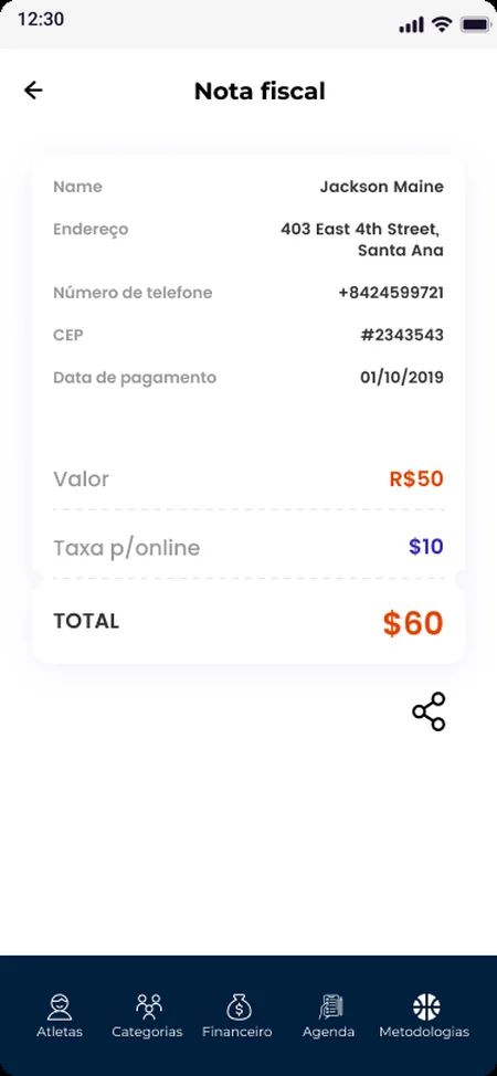
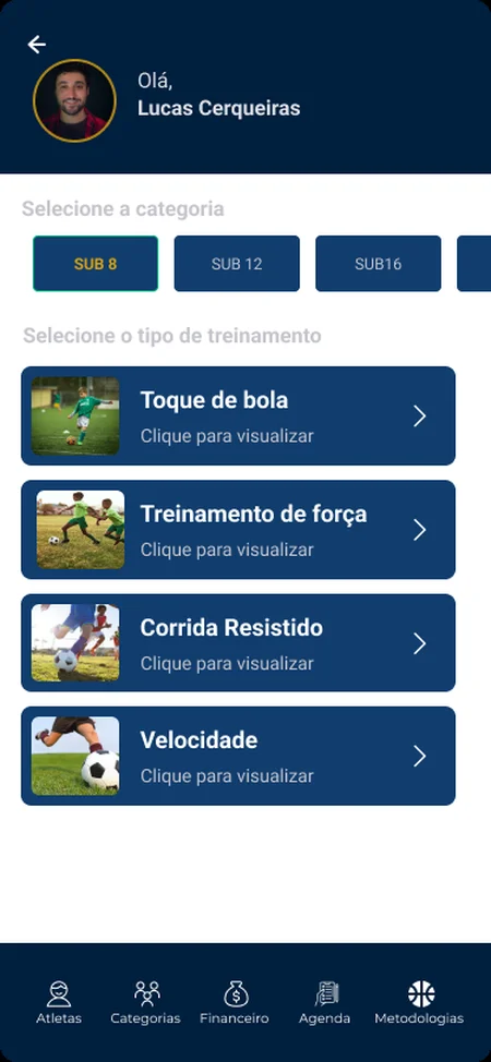
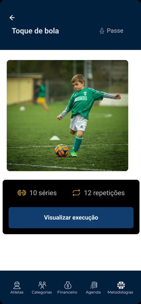
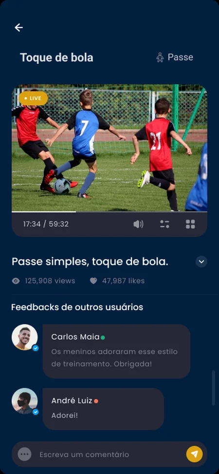
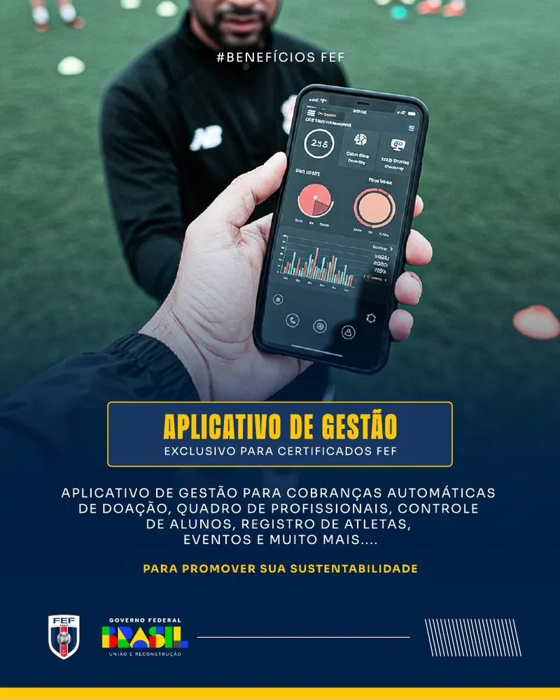
  • Management app with athlete profiles, categories and attendance, a training schedule that alerts parents an hour before, payments and donations, and a library of training drills.
  • Visual identity system of colour, type, graphic elements and layouts used everywhere (the logo was supplied by the client).
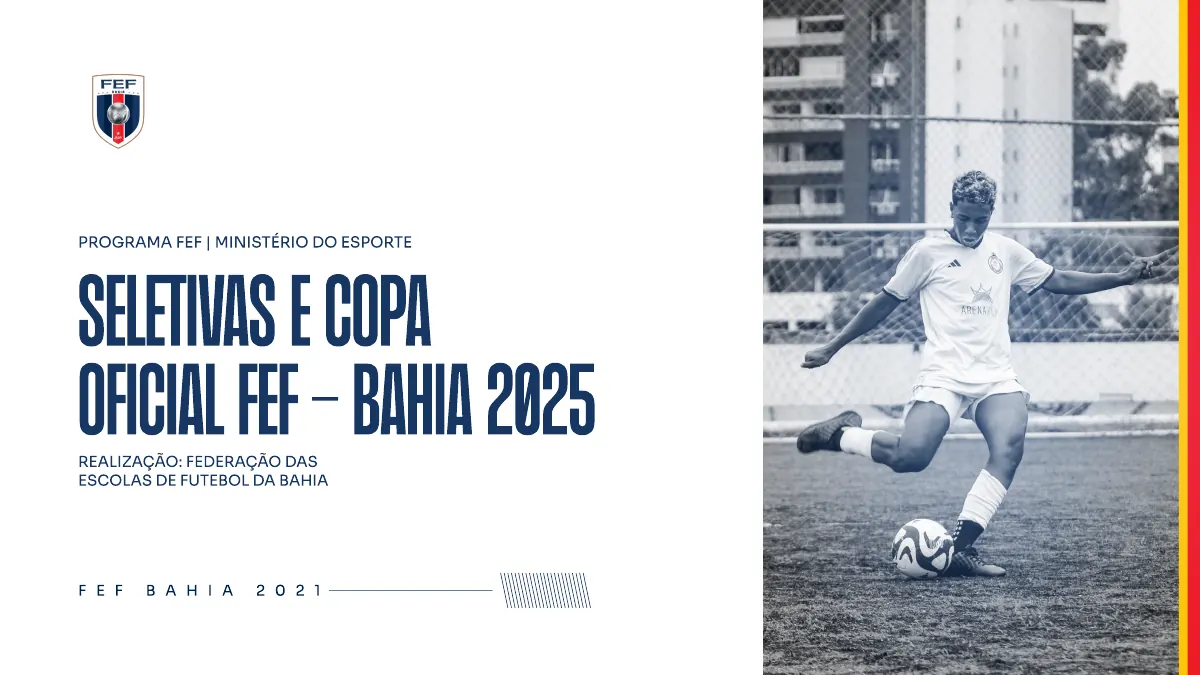
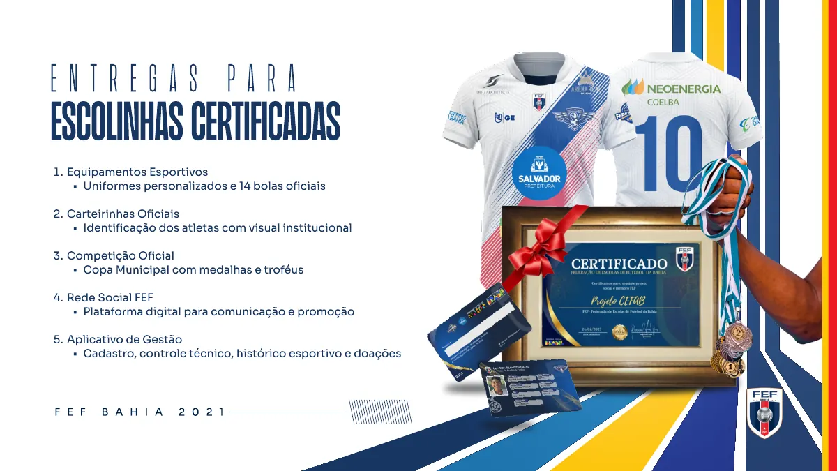
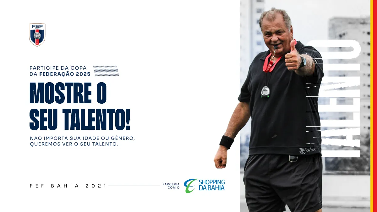
  • Two commercial decks: the programme and sponsorship tiers, and a tailored proposal for a corporate sponsor.
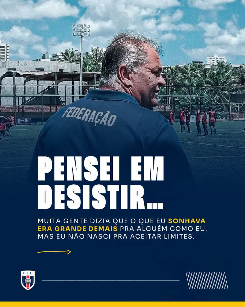
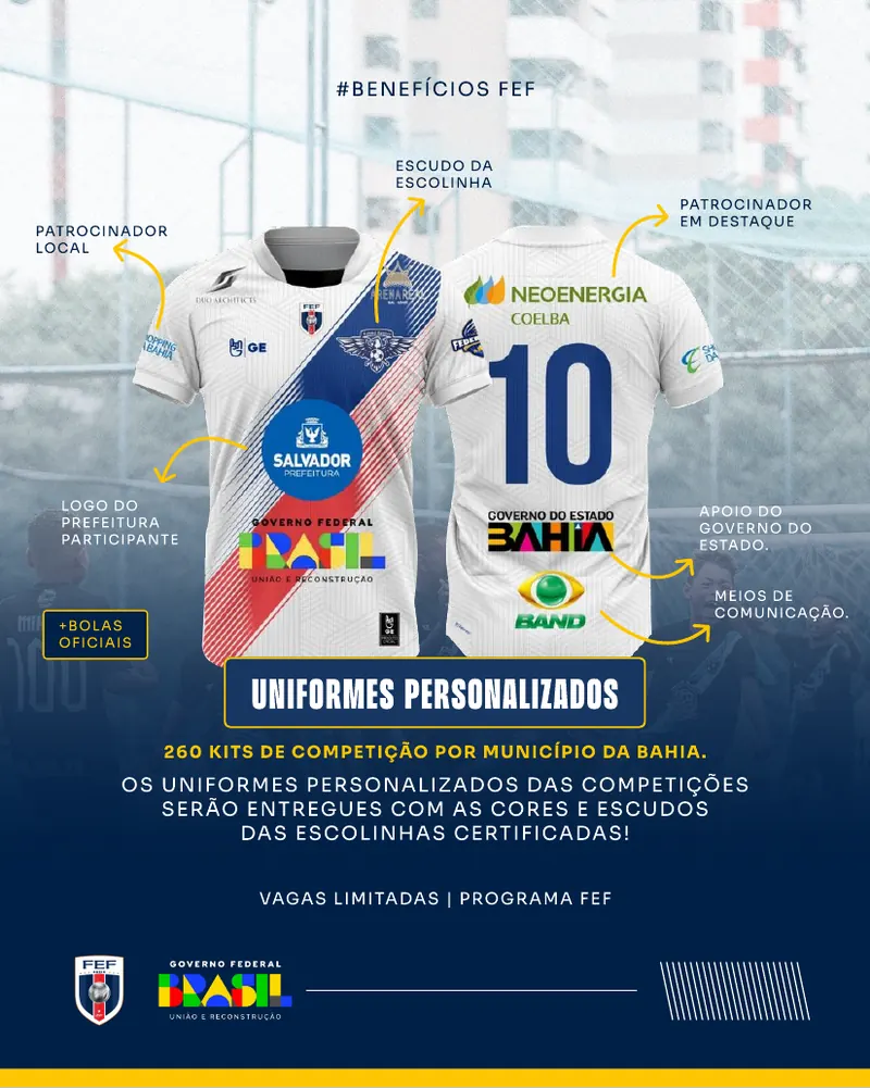
  • Instagram campaign: three carousels and a single post covering the founder's story, the launch, the benefits and a call to action.
R$ 9.9Min planned investment for the programme the campaign launched
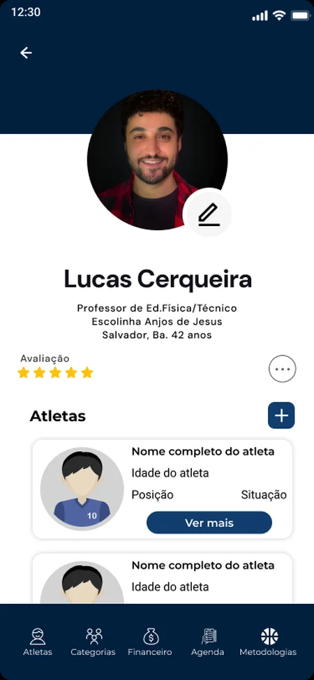
Coach profile with rating and list of athletes
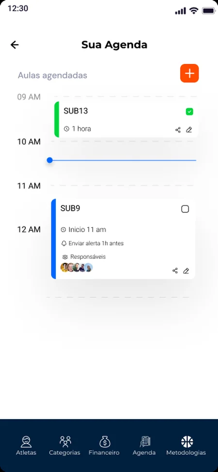
Training schedule with alerts to parents an hour before
Management app, screen by screenScroll sideways →
Coach profile: Rating, school and athletes
01Coach profileRating, school and athletes
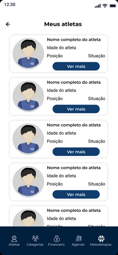
My athletes: Everyone in one list
02My athletesEveryone in one list
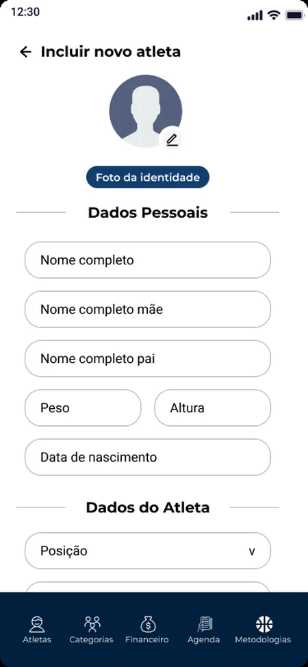
New athlete: Personal, sport, contact and school data
03New athletePersonal, sport, contact and school data
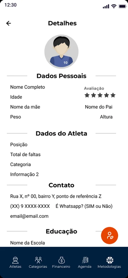
Athlete details: Position, absences, category
04Athlete detailsPosition, absences, category
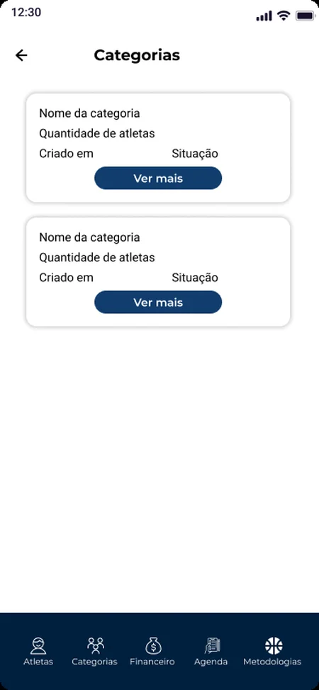
Categories: Groups like U9 and U13
05CategoriesGroups like U9 and U13
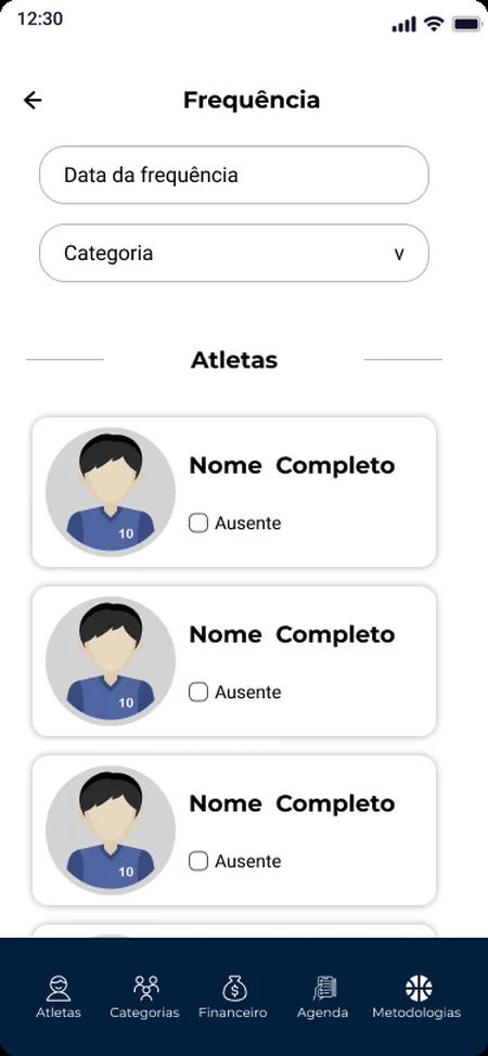
Attendance: Tick who was absent
06AttendanceTick who was absent
Schedule: Sessions with a 1-hour alert to parents
07ScheduleSessions with a 1-hour alert to parents
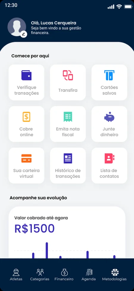
Finance: Charges, invoices and income chart
08FinanceCharges, invoices and income chart
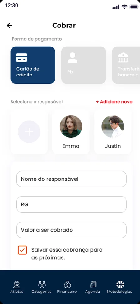
Charge: Bill a parent, save it as recurring
09ChargeBill a parent, save it as recurring
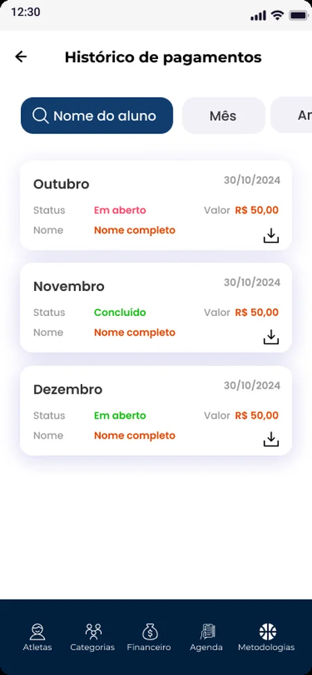
Payment history: Open and paid months
10Payment historyOpen and paid months
Invoice: Shareable receipt
11InvoiceShareable receipt
Training methods: Drills by category and type
12Training methodsDrills by category and type
Drill: Sets, reps and a demo
13DrillSets, reps and a demo
Watch: Video with comments from coaches
14WatchVideo with comments from coaches
Instagram campaignScroll sideways →
Carousel 1: Pensei em desistir… Carousel 2: A FEF chegou! Carousel 2: FEF certificate Carousel 3: A FEF não forma apenas times Carousel 3: custom uniforms Carousel 3: management app
Commercial presentations
Deck cover: Seletivas e Copa Oficial FEF Bahia 2025 Deck slide: deliverables for certified schools Sponsorship proposal cover: Mostre o seu talento

04 / 07PsiPassMental health support as a corporate benefit

  • Client project
  • Mobile app
  • Two user types

The challenge

Companies need to support their employees' mental health, but finding the right professional is slow, expensive and confusing. PsiPass bridges employees and psychologists, and gives psychologists a new way to reach clients.

Research

Interviews, surveys and usability tests with both audiences. Employees wanted quick, low-friction access to support. Psychologists wanted an easier way to manage their schedule and find new clients.

Two users, one platform

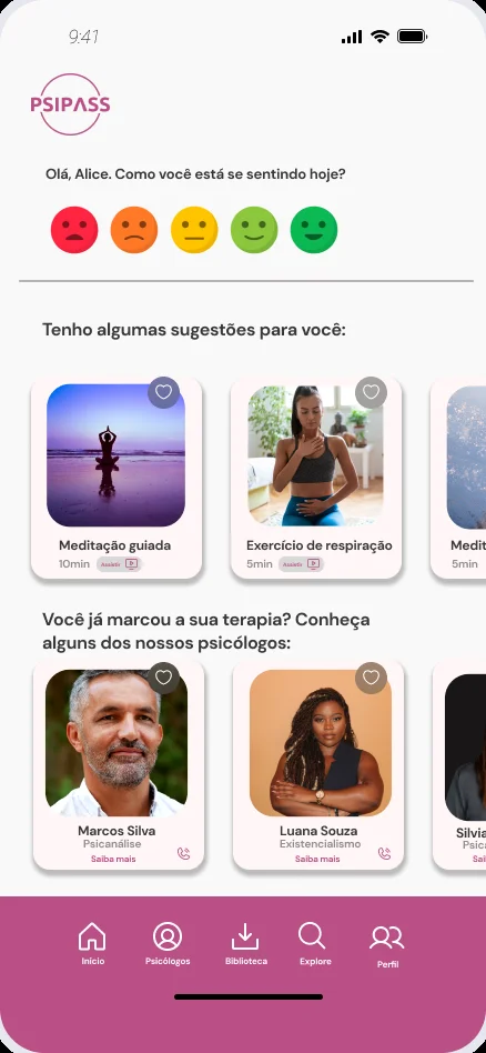
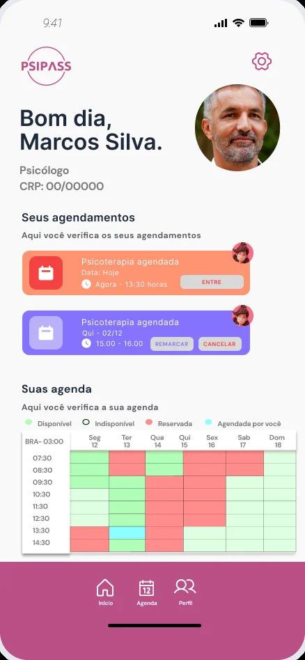
Employees check in on their mood, explore self-care content and book discounted sessions through their company. Psychologists offer their services, manage availability and run video sessions.

My role

End-to-end design: research, information architecture, flows, wireframes and high-fidelity UI for both experiences.

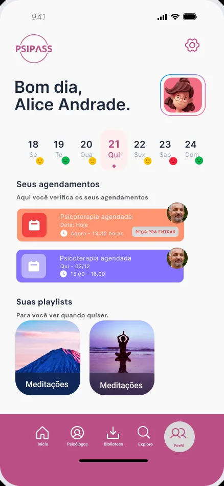
PsiPass home: daily mood check-in, self-care suggestions and psychologists
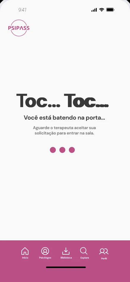
Virtual waiting room: Toc… Toc… You're knocking on the door

Detail I'm proud ofA virtual waiting room. You "knock" on the therapist's door before the session starts.

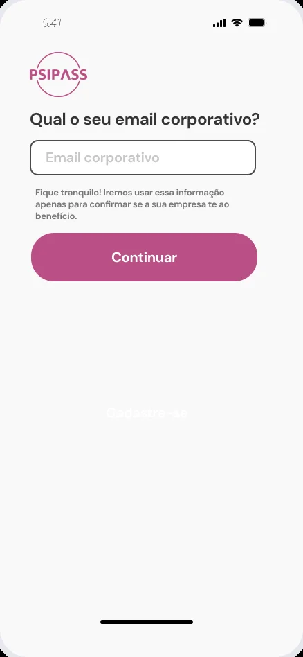
  • Corporate onboarding by work email
  • Daily mood check-in
  • Find a psychologist
  • Self-care library offline

Designing for two sides

  1. Two audiencesInterviews and surveys with employees and with psychologists.
  2. Two needsEmployees want fast, low-effort access. Psychologists want a simpler agenda and new clients.
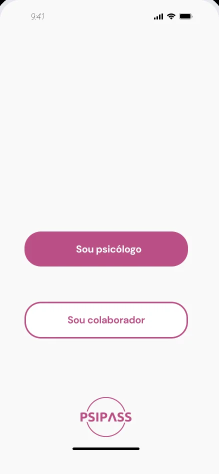
  3. One door, two pathsA single app that splits at the first screen: "I'm a psychologist" or "I'm an employee".
  4. Make it humanMood check-in, self-care content and a waiting room that softens the start of therapy, checked in usability tests.

The journey, screen by screen
Choose your profile: psychologist or employee
01Who are you?One app, two experiences
Corporate email field
02Company checkWork email confirms the benefit
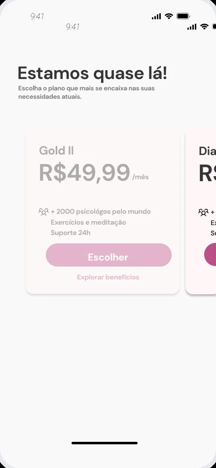
Plan selection
03PlansPick the plan that fits now
Home with mood check-in
04HomeMood check-in and suggestions for today
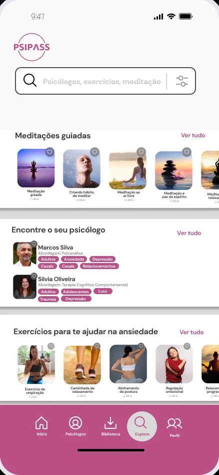
Explore: meditations, psychologists, exercises
05ExploreMeditations, psychologists and exercises
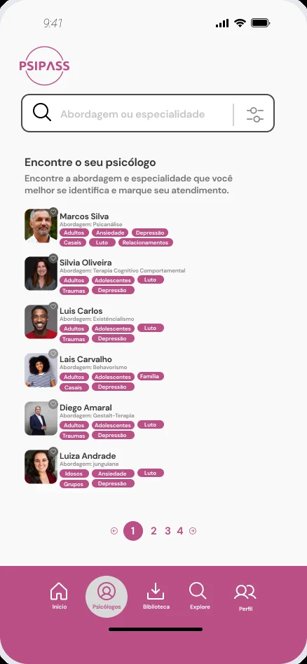
List of psychologists with tags
06Find a psychologistFilter by approach and specialty
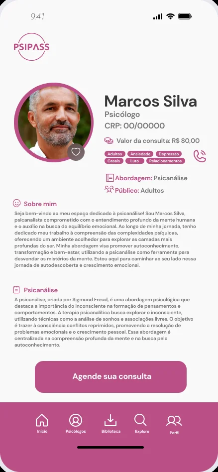
Psychologist profile with price and approach
07ProfileApproach, audience, price, about
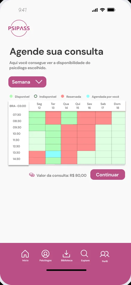
Weekly availability grid
08Book a sessionPick a free slot on the week grid
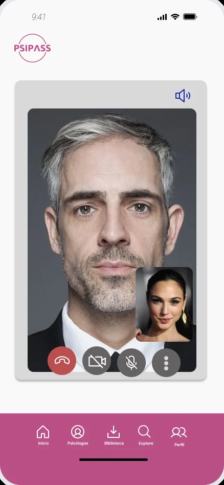
Waiting room: Toc… Toc…
09Waiting roomYou knock, the therapist lets you in
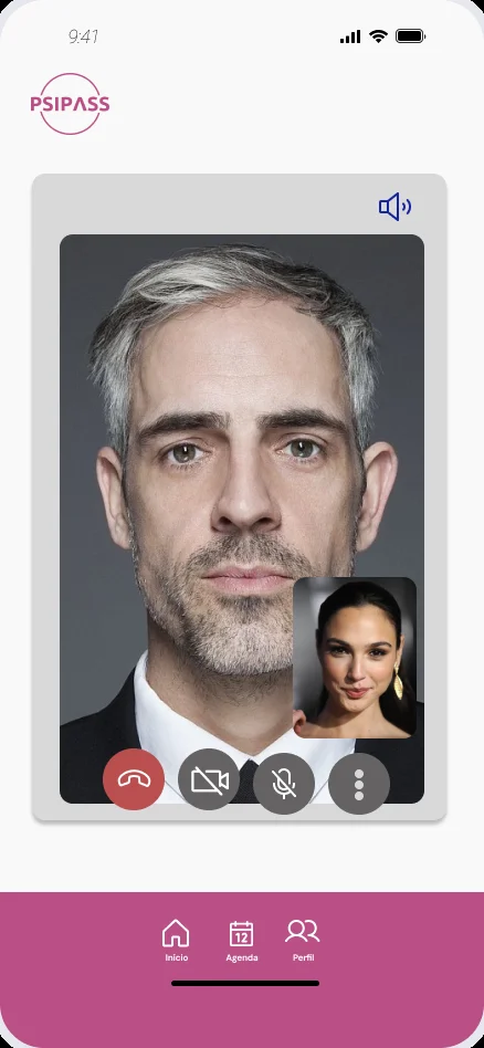
Video session
10SessionVideo call inside the app
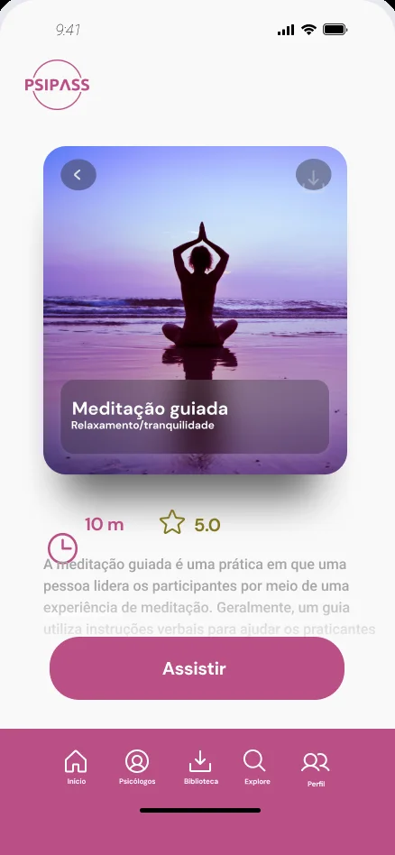
Guided meditation detail
11Self-careGuided meditation, 10 minutes
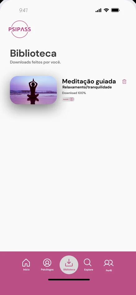
Downloads library
12LibraryDownloads for offline use
Employee profile with agenda and playlists
13My spaceAppointments and playlists

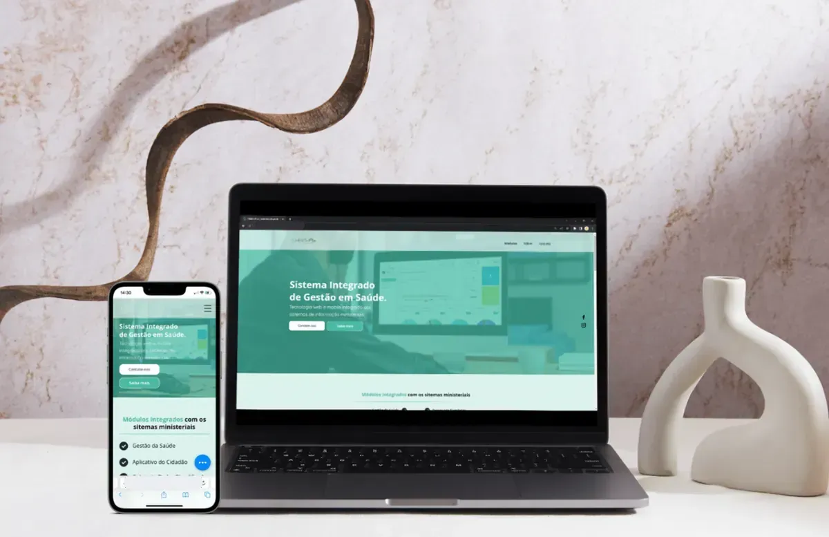
05 / 07Health PlusIntegrated public health management system

  • Client · Horizon
  • Web + mobile
  • 5 days

The project

A web and mobile platform integrated with the Ministry of Health's information systems, built to cut operational costs, improve public health services and strengthen contingency planning.

What I did

Working with the IT manager, I reworked the system's visual identity with a more modern interface and a standard for colour and typography. A navigable high-fidelity prototype validated the MVP scope, and usability tests drove incremental improvements from user and manager feedback.

  • Briefing
  • Wireframe
  • Moodboard
  • Hi-fi desktop
  • Hi-fi mobile
  • Styleguide

Outcome

In five days the client had a validated MVP scope, a refreshed visual identity and a styleguide the developers could build from.

Tools

Figma, Notion, Miro, Google Meet

Health Plus homepage on laptop and phone

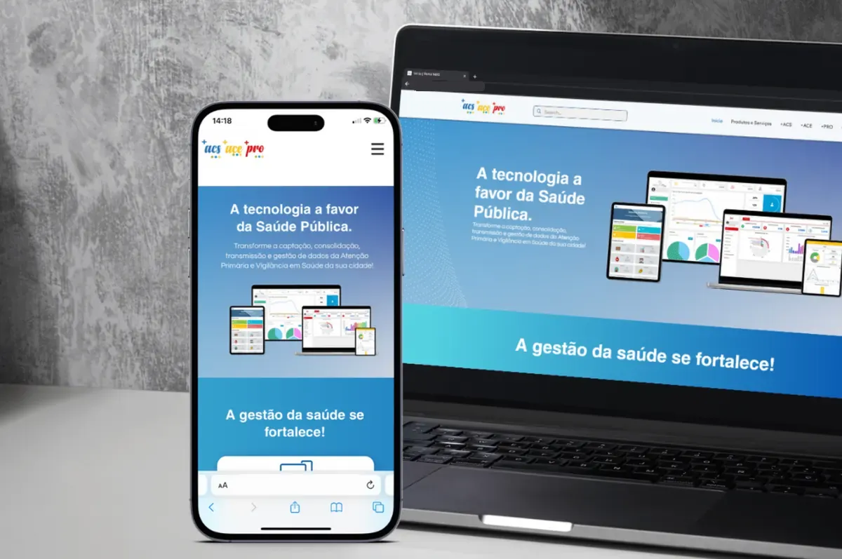
06 / 07Portal +Website and styleguide for a public health product family

  • Client · Horizon
  • Website
  • 12 days

The project

Portal + helps municipal health departments run their operations with availability, quality and transparency of information, supporting public policy within Brazil's public health system (SUS).

What I did

I designed the website for its product family (ACS, ACE and PRO), built a high-fidelity prototype to validate the MVP and ran usability tests with users and managers.
Design system

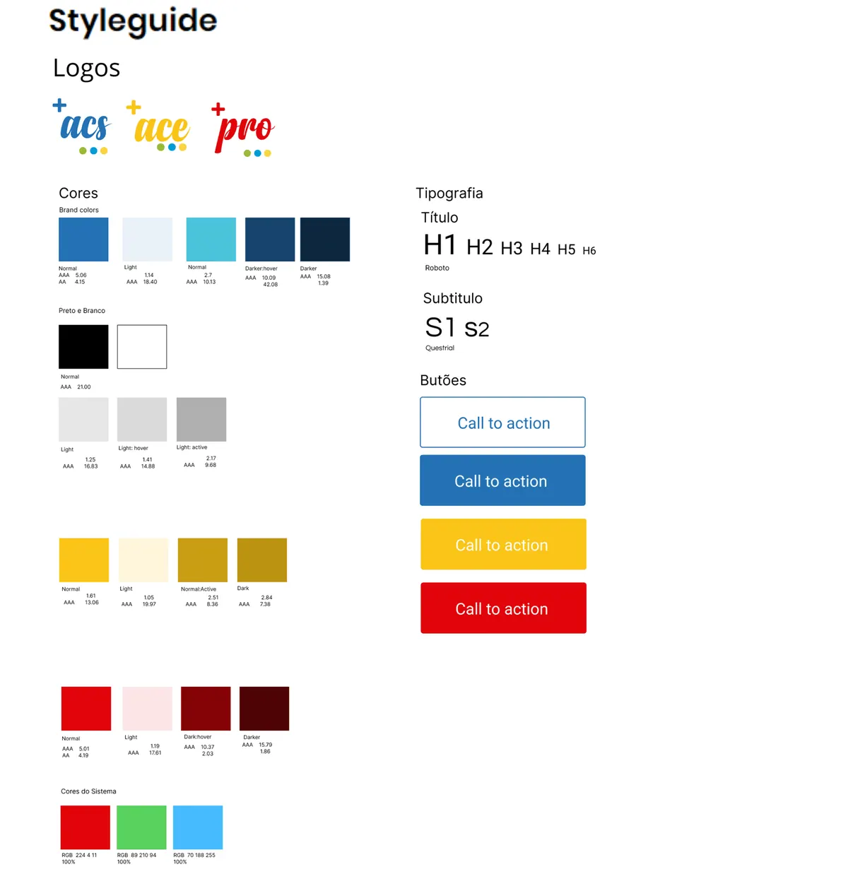
A complete styleguide: product logos, brand and system colours with accessibility ratings, a type scale and button states.
  • Briefing
  • Wireframe
  • Moodboard
  • Hi-fi desktop
  • Hi-fi mobile
  • Styleguide
Portal + website on laptop and phone
Portal + styleguide with logos, colours, typography and buttons

07 / 07LovePatasPet adoption you can trust

  • Study project
  • Mobile app
  • Research-led

The idea

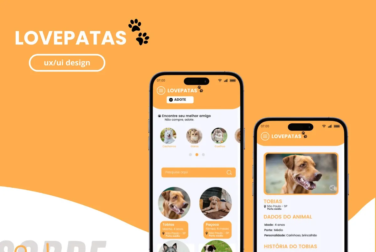
A study project: an app that connects people who want to adopt a pet with nearby shelters and rescuers, making adoption simpler and friendlier.

The challenge

Making sure information about animals and shelters is genuine, to prevent fraud and animal exploitation.

Solutions

  • Shelter verification before any listing goes live
  • User reviews of shelters after adoption
  • Partnerships with trusted animal welfare organisations
  • Desk research
  • CSD matrix
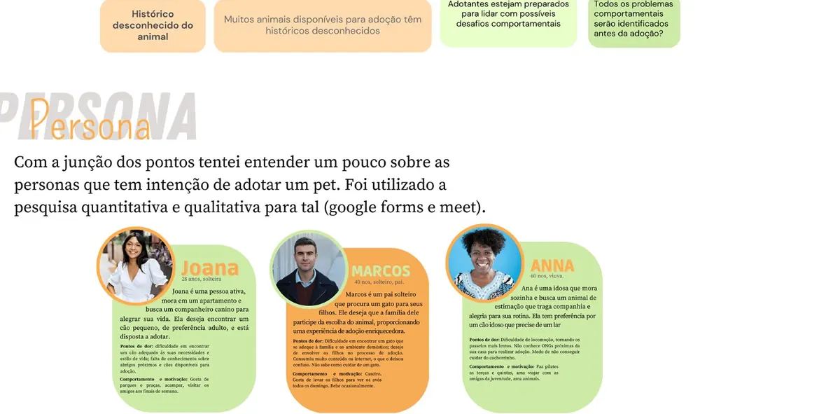
  • Personas
  • Empathy maps
  • Information architecture
  • Wireframes
LovePatas app screens
LovePatas personas

brand
identity

Logos and visual systems for businesses that wanted to look as good as they are.

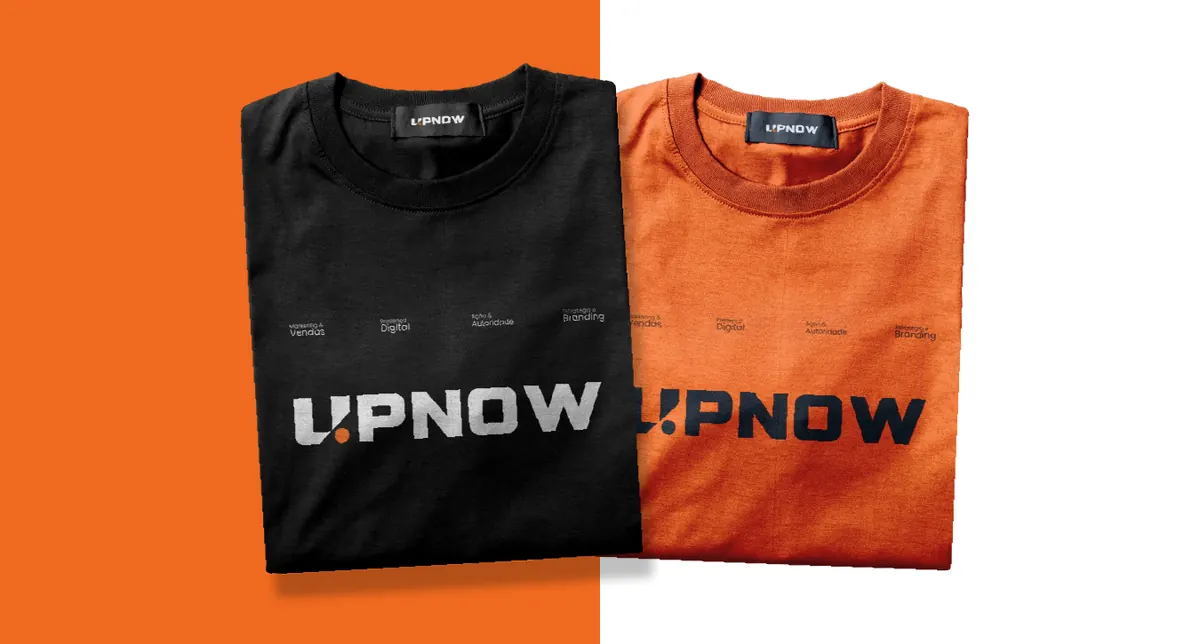
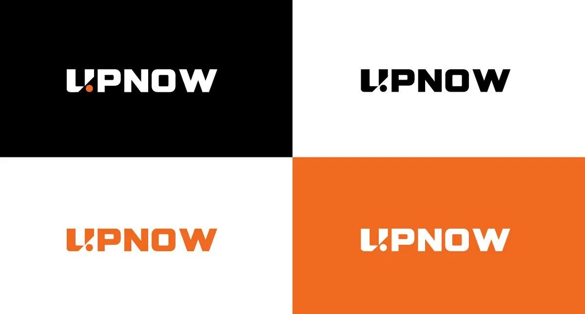
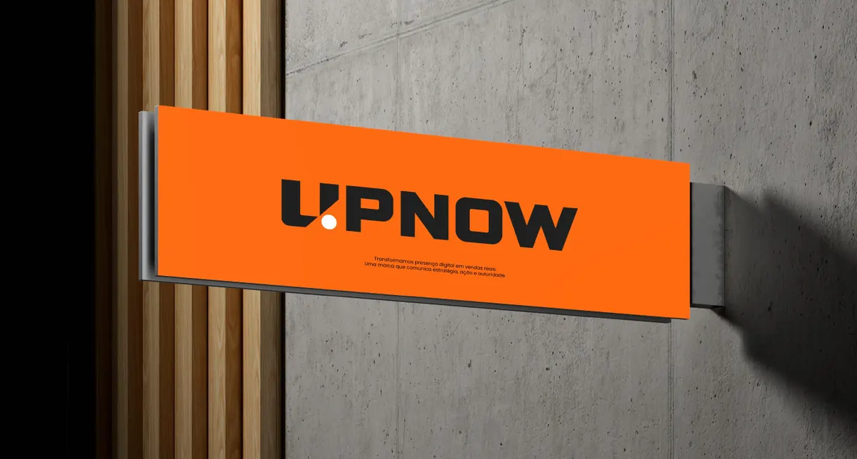
UPNOW sign on a concrete wall UPNOW T-shirts in black and orange UPNOW logo on four backgrounds

Client · Marketing agency · Logo + identity

UPNOW

An agency that turns digital presence into real sales. The "U" and a dot form an upward arrow, a visual UP for growth, carried into a bold wordmark, a logo pattern, signage, stickers and merch.

"Give your success an UP."

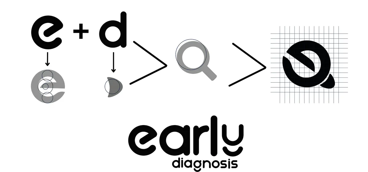
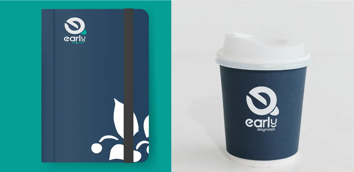
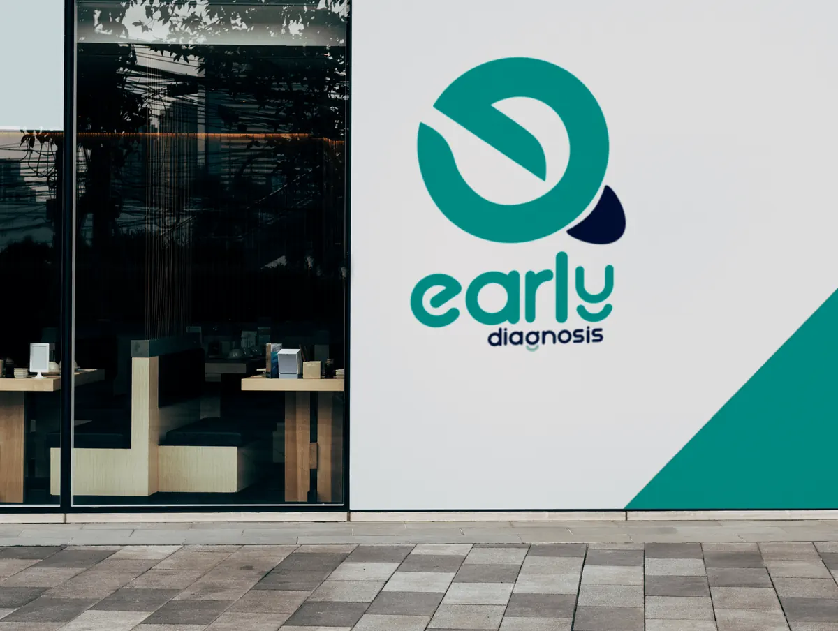
Early Diagnosis logo on a storefront Logo construction: e plus d becomes a magnifying glass Early Diagnosis notebook and cup

Client · Health tech · Logo + identity

Early Diagnosis

A tool that uses validated questionnaires to spot psychosocial risks at work. An "e" and a "d" merge into a magnifying glass, a symbol of early detection.

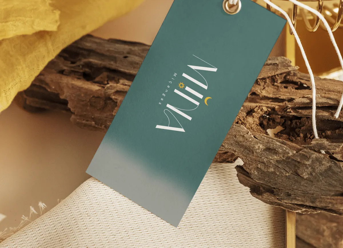
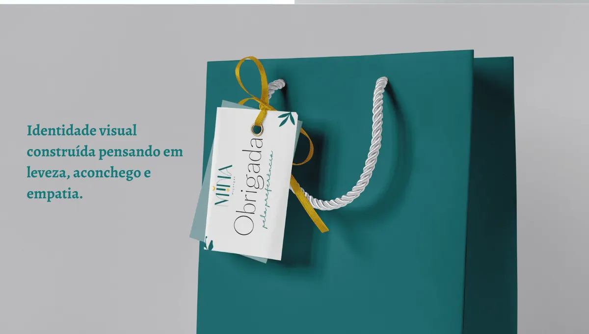
Mina Miçangas hang tag Mina Miçangas logo on teal Mina Miçangas shopping bag

Client · Bead jewellery · Logo + identity

Mina Miçangas

An identity built on lightness, warmth and empathy: delicate type with a sun-and-moon detail, applied to tags, cards, bags and signage.

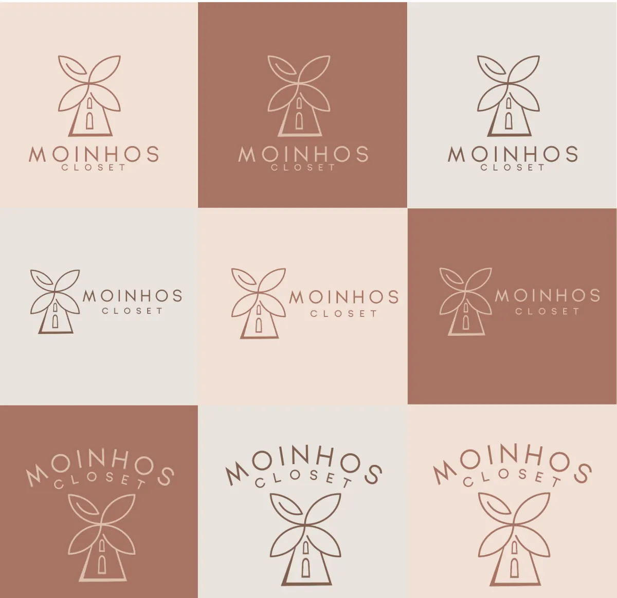
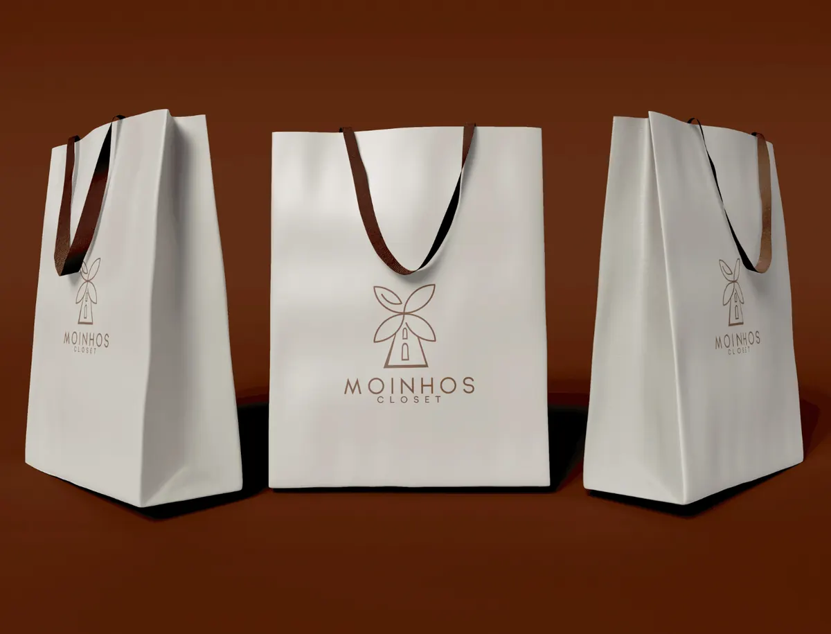
Moinhos Closet shopping bags Moinhos Closet logo variations Moinhos Closet clothing label

Client · Clothing store · Logo + identity

Moinhos Closet

A windmill whose blades are leaves, joining the store's name with a natural, cosy feel. An earthy palette carried through bags, buttons, labels and the storefront.

experience

  1. HorizonProduct Designer & Creative Director
  2. Clínica FamiliareJunior UX/UI Designer → UX/UI Designer → Product Designer
  3. FreelanceGraphic Designer: logos, visual identities, print and packaging
  4. FreelanceSocial Media Specialist

Skills

  • Product Design
  • UX Research
  • User Testing
  • Design Systems
  • Prototyping
  • Discovery
  • Design Thinking
  • User Journeys
  • Information Architecture
  • Accessibility
  • UX Writing

Tools

  • Figma
  • FigJam
  • Adobe XD
  • Sketch
  • Adobe Suite
  • Miro
  • Maze
  • Hotjar
  • Notion
  • HTML/CSS

Education

  • Graphic Design (technologist degree)
  • Systems Analysis & Development, UNIFACS
  • Google UX Design, Google (Coursera)
  • UX/UI Design, Cubos Academy
  • Design Thinking and User Experience, FIAP

Languages

Portuguese (native) · Spanish (advanced) · English (intermediate) · Italian (basic)

let's talk

I'm open to Product Designer and UX/UI Designer roles, remote or hybrid, anywhere in Europe. Send me a message on LinkedIn and I'll get back to you.